Academic works
During my studies at ESDIR (Escuela Superior de Diseño de La Rioja), one of Spain's most prestigious design schools, I developed numerous projects that allowed me to explore different areas of graphic design, from the conceptual to the technical.
These projects were key to building a solid foundation and developing my own creative vision. Through them, I learned to research, experiment, and solve visual problems with sound judgment, creativity, and coherence.
Here I share a selection of those academic projects, which, to this day, remain an important part of my career as a designer.


Design Walk 2020
In 2020, I designed the poster for the Design Walk, an event organized by ESDIR in which each department visited different studios and creative spaces in the city of Logroño, connecting directly with the professional world of design.
The poster served not only an informative purpose but also a participatory one. Designed as a blank canvas, it allowed each student to personalize it with stickers distributed at various points along the route. In this way, each person created their own unique poster, making the experience more personal and memorable.
A project in which graphic design became a medium for interaction, creativity, and collective learning.
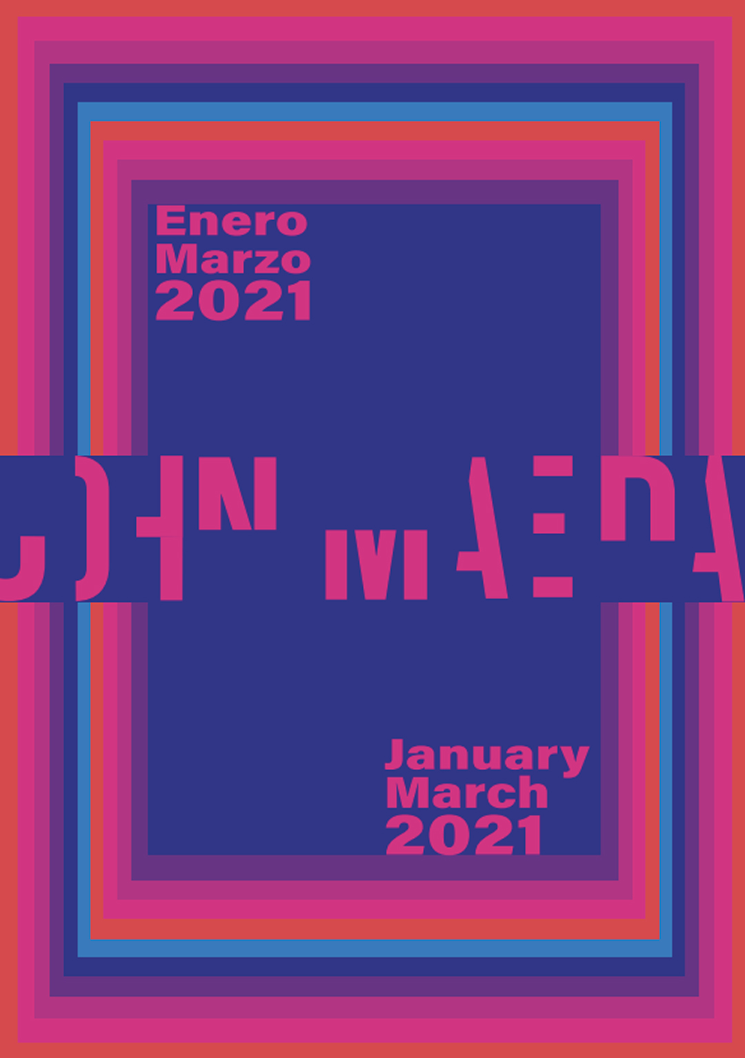
John Maeda poster
John Maeda, designer, technologist, and a leading figure at the intersection of art and science. The brief was clear: not only to inform about the exhibition, but also to capture the spirit of his work and philosophy.
I was inspired by his minimalist approach, his fascination with simplicity, and his ability to find beauty in functionality. I used precise geometric forms and clean typography that evoked the conceptual clarity that characterizes his work. I also wanted to incorporate a visual, interactive element that would invite the viewer to pause and observe, just as Maeda suggests in many of his manifestos on design and technology.

")

")
")
")
")
")
")
")
")
")
")
")

")

")
")
")
")
")
")
")
")
")
")
")
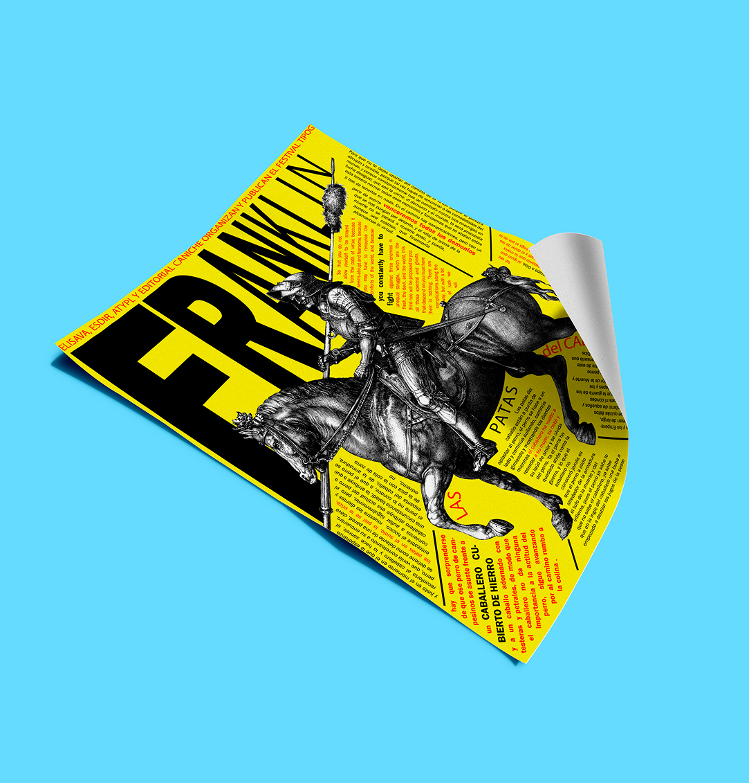
Typographic Festival Poster
This poster was created as part of an academic exercise for the Franklin Typographic Festival, with the aim of paying homage to the Franklin Gothic typeface. For the design, I drew inspiration from the work of Paula Scher, a key figure in contemporary graphic design, known for her expressive use of typography, dynamic composition, and her ability to transform letters into images with their own distinct identity.
The result is a vibrant, typocentric poster where form and message merge. More than just an informative poster, I wanted it to be a visual piece with its own voice, capable of communicating not only the event but also the passion for typography as a means of expression.
Banzai
Banzai was born as a brand with a purpose: to raise awareness about the use of animals in the fashion industry. From the concept to the graphic design, every element of the brand was conceived to provoke reflection and dialogue through everyday garments like t-shirts and tote bags.
The central illustration is a key piece of the message. It symbolically and critically represents the relationship between humans, fashion, and animals. The image aims to unsettle, but also to generate empathy and question our consumption choices.
Aesthetically, the brand is inspired by the art of Hokusai, especially his use of line, movement, and visual impact. This reference to traditional Japanese art is not accidental: like Hokusai, Banzai seeks to convey powerful messages through a carefully crafted, direct aesthetic with a strong graphic identity.
.


Typography Walk
This illustration was created for the Typography Walk in Logroño, a project that celebrates the form and expressive power of letters. In my case, I worked with the letter "i," to which I wanted to give a central and symbolic role.
The design revolves around a fortune-telling figure who uses the letter "i" as if it were a crystal ball. This scene transforms the "i" into an object laden with mystery and meaning, inviting the viewer to see it from a new perspective.
To emphasize its prominence, I decided not to directly alter the letter. The "i" appears clean, without modifications, while the entire design and context are built around it. The background is carefully illustrated to enhance its presence without competing with it. I wanted the letter to shine on its own, like a calm symbol surrounded by a visually rich and symbolic world.
It was an exercise in balance between illustration and typography, where respect for the letter's original form coexisted with the creative freedom of the graphic environment.
Proyecto Financiado por la Unión Europea - NextGenerationEU
Política de Accesibilidad
